
User Management Just Got a Cleaner, Easier-to-Navigate Redesign
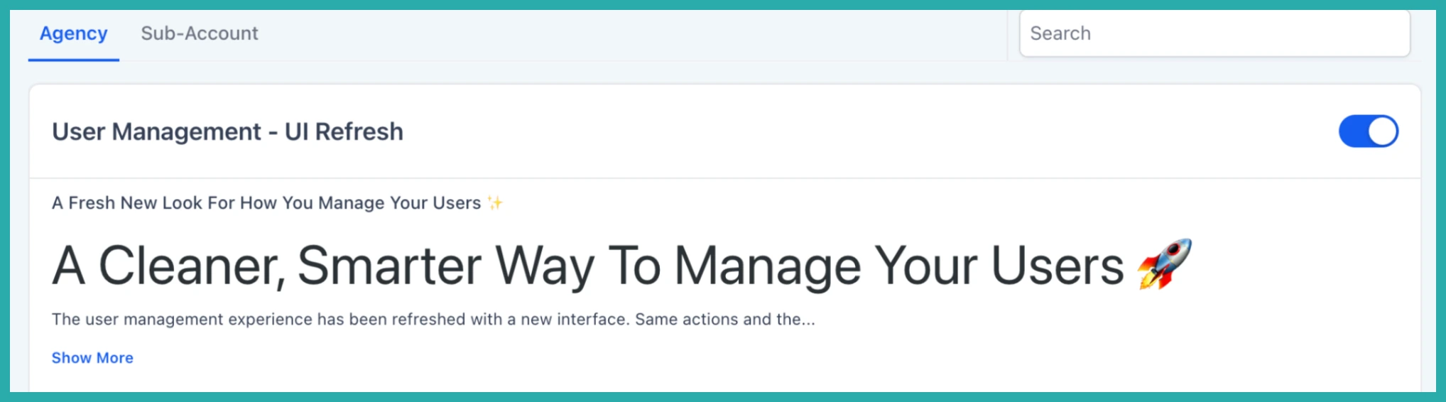
A quick heads-up: this one's in Labs
It's an early feature you turn on yourself in Settings > Labs inside your account. It works, but it's still in development - the documentation and support is limited and not everything will behave perfectly yet.
If you like getting your hands on new things early, switch it on and have a play. If you'd rather wait for the finished, fully-supported version, leave it off and we'll let you know when it lands.
The screens where you manage your own profile and any users in your account have had a proper tidy-up. Same settings, same data, same permissions - just laid out so you can actually find things.
Nothing you rely on has changed under the hood. Your profile details, your users, and your permission setups all carry over exactly as they were. This is about making them easier to move around.
My Profile is now split into tabs
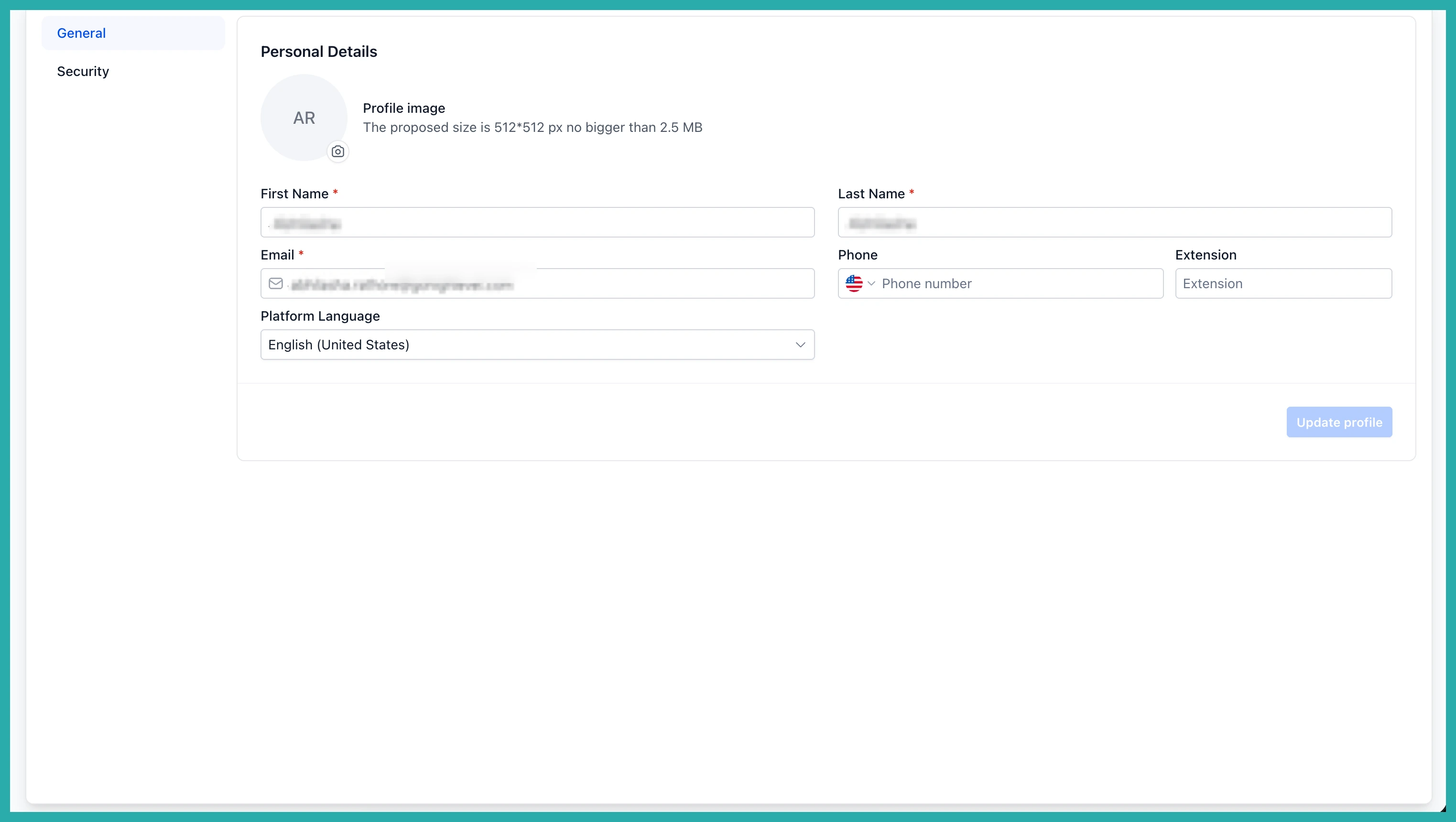
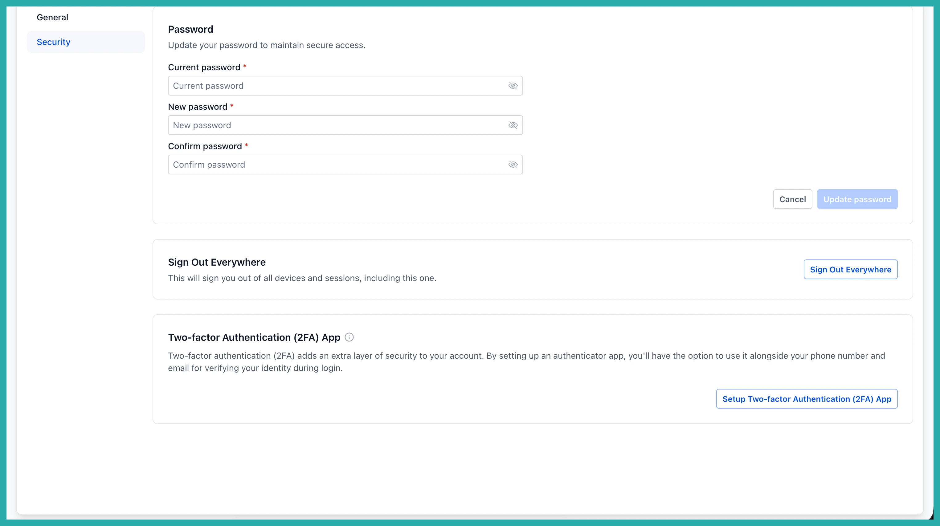
Instead of one long scrolling page, your profile settings are grouped into clearly labelled tabs. At the account level you'll see a General tab for your personal details and a Security tab for things like your password, signing out everywhere, and two-factor authentication.
In the screenshot below, that's the General tab with your basic details.
And here's the Security tab, keeping all your login and protection settings in one place.
More tabs inside a client account
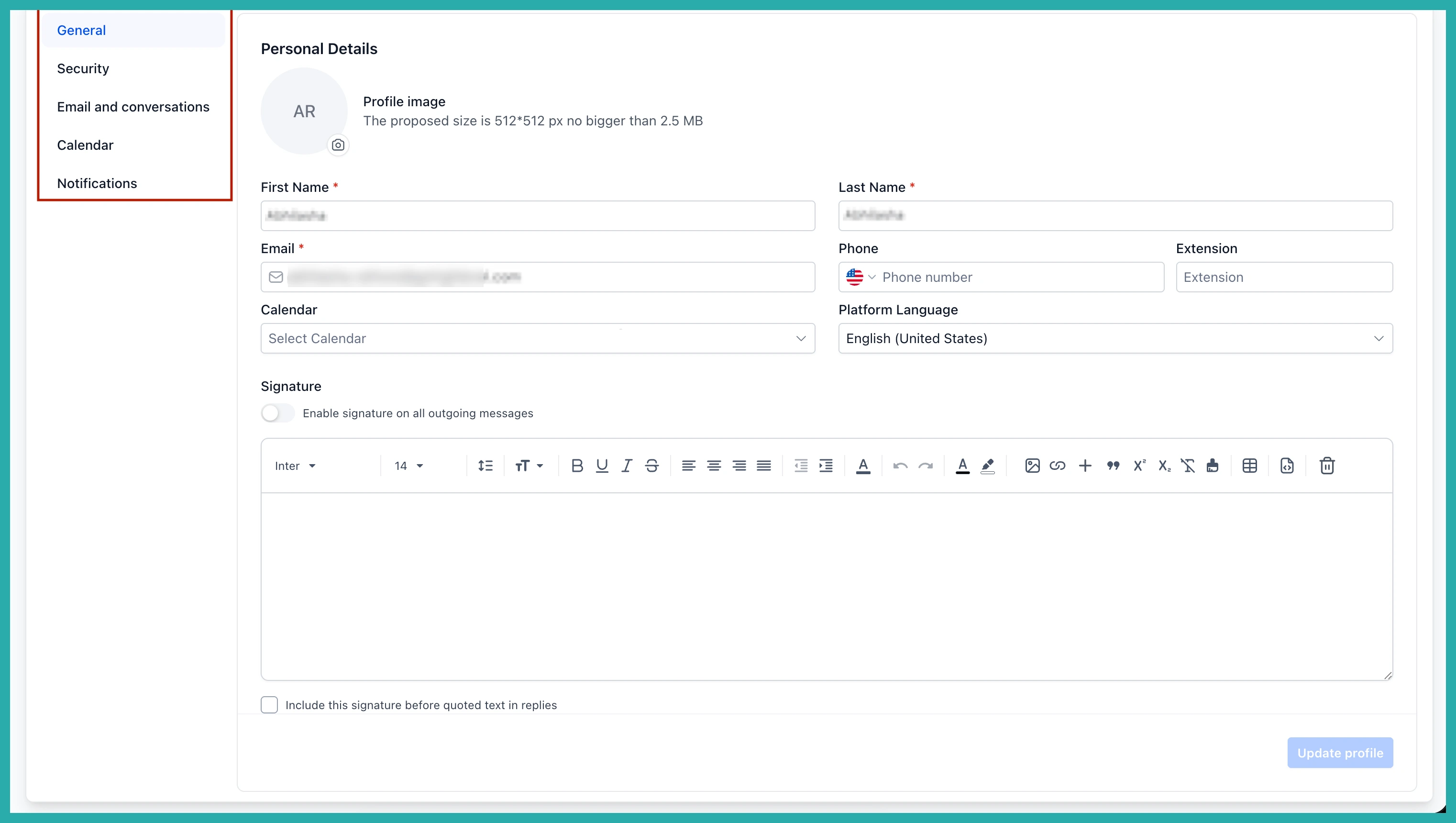
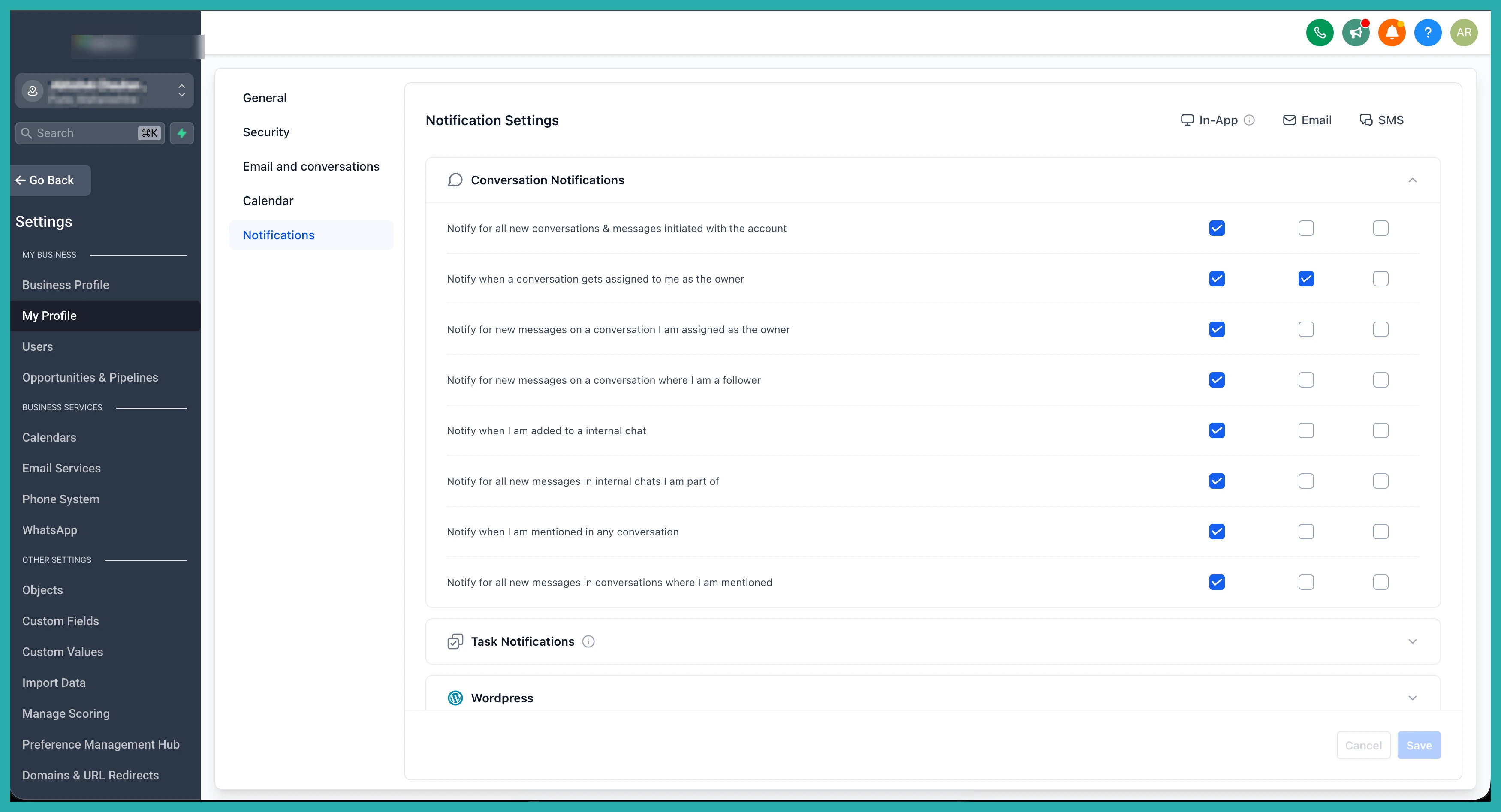
When you're working inside one of your accounts, My Profile gives you five tabs: General, Security, Calendars, Conversations, and Notifications - all with the refreshed look.
Below is the General tab with your personal details.
The Notifications tab is the one that really benefits. It now shows your notifications channel by channel, so you can see at a glance what's switched on and where, instead of hunting through a cluttered list.
"Team" and "My Staff" are now just "Users"
The naming is finally consistent. What used to be called "Team" in one place and "My Staff" in another are now both simply called Users, everywhere. Only the label has changed. The screen does exactly what it always did.
The Users listing itself has a cleaner look too, which makes viewing and managing people less of a chore.
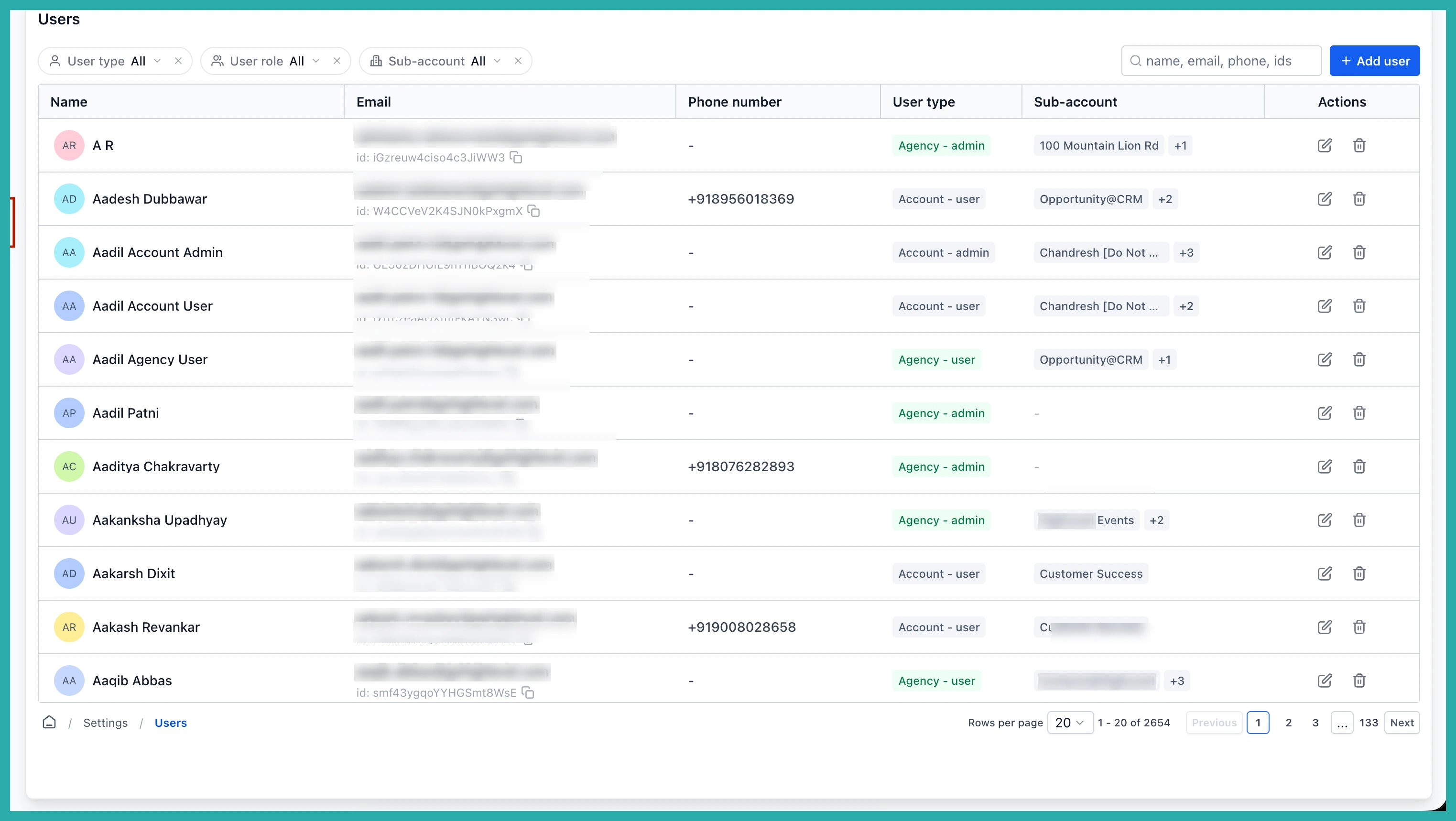
Adding and editing users is clearer
The flows for creating and editing a user have been refreshed, including how you set their permissions.
The biggest improvement is the Roles and permissions tab. Instead of scrolling the whole page, you pick a permission module from a panel on the left. The settings inside each one sit in a collapsed accordion so the view stays clean, and you can search for a module to jump straight to it.
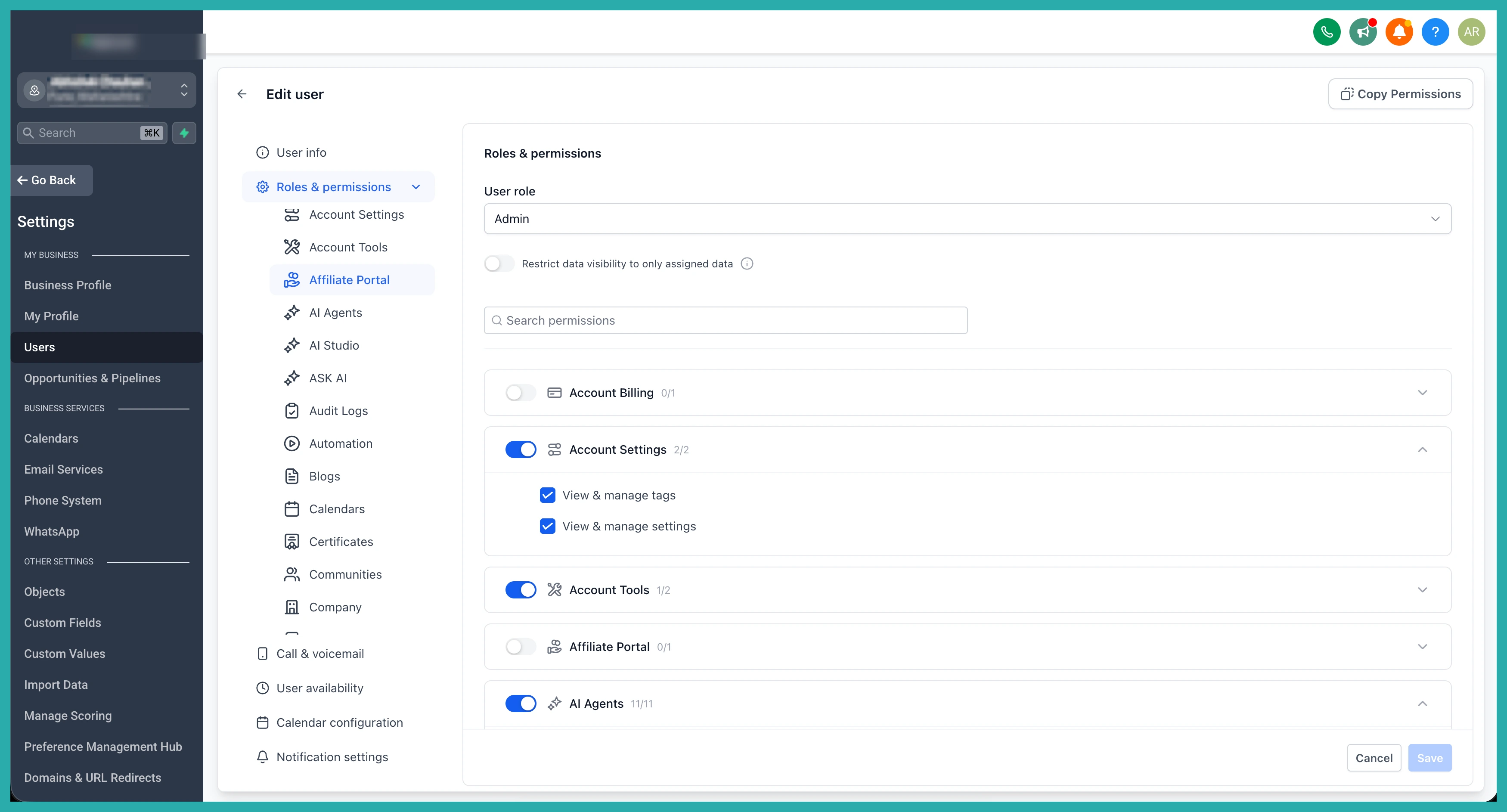
The other tabs in the client-account edit flow have been revamped too - call and voicemail settings, user availability, calendar configuration, and notification settings all get the same tidier treatment.
Have a click around your own profile and Users screen. Everything's where you'd expect, just easier to get to.
