
Style Your Emails for Phones Without Touching Your Desktop Design
You build an email, it looks lovely on your screen, and off it goes. Then you open it on your phone and the spacing feels cramped, the button is tiny, and the whole thing reads differently to how you pictured it.
Most of your readers are on a phone. So now you can design for them properly.
What landed
Mobile View Controls let you style how an email looks on a phone separately from how it looks on desktop. You can adjust supported sections and elements for small screens without rebuilding anything.
The clever part: your mobile settings start by inheriting your desktop design. Nothing changes until you decide to change it. So you only tweak the bits that actually need it on a phone.
What you can adjust
- Spacing: Set mobile padding and margins for sections and supported elements. Tighten oversized gaps or add room around content so it breathes on a smaller screen.
- Buttons: Choose mobile button alignment, including full width, and adjust the button text and spacing so your call to action is easy to see and tap.
- Images and visuals: Set mobile alignment, dimensions and padding for images, logos and videos. Aspect-ratio locking keeps everything in proportion. Social icons get their own mobile alignment, size and spacing controls too.
How to use it
- Go to Marketing, then Emails, and open or create a campaign or template in the Design Editor.
- Select a section or a supported content element.
- Open Style and find the device selector beside the setting you want to change.
- Choose Mobile, adjust the values, and check the mobile preview as you go.
In the screenshot below, you'll see the device selector sitting right next to the styling options, ready for you to switch between Desktop and Mobile.
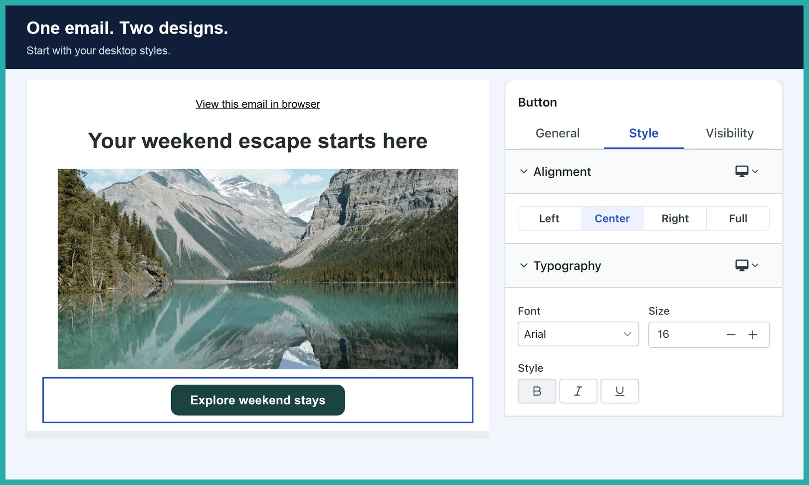
When you're happy, save, click the eye icon to open Preview, then flip between Desktop and Mobile to review both.
Worth knowing
- Mobile styles inherit your desktop values until you change them.
- Your existing campaigns and templates keep their current look unless you update their mobile styles.
- Controls vary by element, so use the device selector wherever it appears.
Pick one email you send often and spend five minutes on the mobile view. Most of your readers will see that version, and now it can look just as good as the one on your screen.
